Most B2B websites were not built for how people actually live and work today.
They were designed for large screens, long attention spans, and ideal conditions. The truth is far less perfect. Decision-makers are busy. They are moving between meetings, answering messages on the go, and squeezing research into whatever quiet moments they can find. Often, that research starts on a phone.
When someone visits your website on mobile, they are not browsing casually. They are trying to solve a problem quickly. If your site feels slow, confusing, or overwhelming, they do not complain. They leave. And you may never know that opportunity existed.
This is why mobile-first design is no longer optional for B2B businesses. It is not a trend. It is a response to how real people behave.
The quiet shift in B2B buying behavior
B2B buying has become more human and more fragmented at the same time.
A buyer might glance at your homepage in the morning, skim a case study during a break, and revisit your pricing days later from a laptop. Each visit is short, purposeful, and emotionally driven by urgency or curiosity.
Mobile plays a key role in that process. It is where first impressions are formed. It is where trust either begins or quietly disappears. Even if the final decision happens elsewhere, the mobile experience often determines whether the journey continues.
When a site works smoothly on mobile, it signals competence and respect for the buyer’s time. When it does not, it creates doubt.
Why mobile-first design truly matters for B2B
First impressions are emotional, not technical
When someone lands on your site from their phone, they are asking a simple question in their mind: can this company help me?
They are not evaluating your design language or your technology stack. They are reacting to how the site feels. Is it clear? Is it fast? Does it make sense? A calm, well-structured mobile experience builds confidence before a single word is read closely.
Buyers do not stay on one device
Real buying journeys are messy. People switch devices constantly. A mobile-first site respects that reality. It makes information easy to scan now and easy to return to later. That sense of continuity matters more than most teams realize.
Mobile-first thinking creates better decisions
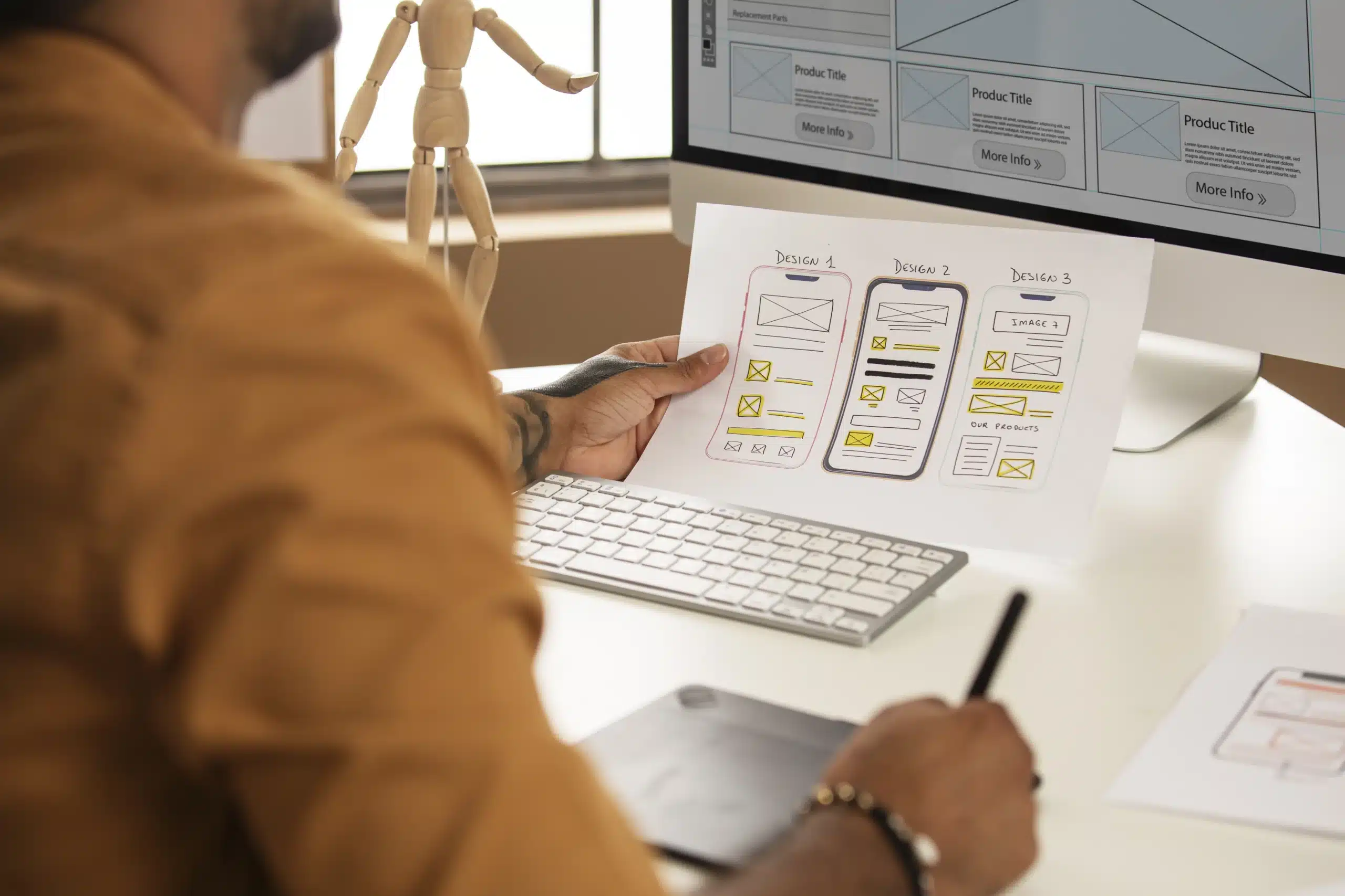
Designing for mobile forces focus. You cannot hide behind long explanations or crowded layouts. You have to decide what matters most to the buyer. Companies that invest in custom web design Utah often find that mobile-first planning sharpens their message and removes distractions that were quietly hurting engagement.
Small actions matter more than big commitments
On mobile, buyers are rarely ready to make a big decision. But they are open to small ones. Requesting a call. Booking a demo. Sending a quick message. When those actions are easy, momentum builds. When they are hard, interest fades.
What a human-centered mobile-first site looks like
Content that feels considerate
Mobile content should feel like it was written for someone in a hurry. Clear headlines, short paragraphs, and honest language make information easier to absorb. The goal is not to impress. It is to help.
Navigation that reduces friction
Buttons should be easy to tap. Menus should be obvious and predictable. Forms should ask only what is truly necessary. Every extra step adds hesitation, and hesitation leads to abandonment.
Performance that builds trust quietly
Speed matters because people associate it with reliability. A fast, stable mobile experience feels professional and reassuring. Many businesses pair this work with professional SEO services in USA to ensure their site is not only discoverable, but also dependable when visitors arrive.
Measurement that reflects real behavior
Mobile analytics are not just numbers. They tell a story about where people hesitate, where they lose confidence, and where they decide to engage. Listening to that story leads to better decisions.
Common mistakes that feel small but cost big
- Treating mobile as a scaled-down version of desktop
- Hiding important information to keep pages short
- Overloading pages with visuals that slow everything down
- Assuming mobile visitors are less serious than desktop users
These mistakes often come from good intentions, but they quietly undermine trust.
Mobile patterns that support real people
- Clear opening messages that explain what you do without jargon
- Persistent contact or demo options that do not interrupt reading
- Expandable sections for those who want more detail
- Simple paths that help users find what they need without thinking too hard
These choices make the experience feel supportive rather than demanding.
Signs your mobile-first approach is working
- Visitors stay longer and scroll with intention
- Fewer people leave after viewing just one page
- More demo requests and inquiries start on mobile
- Buyers move comfortably from mobile research to desktop conversations
- Your site feels easier to use, even internally
These signals often appear gradually, but they are meaningful.
A realistic way to improve without disruption
- Month one
Pay attention. Review how people actually use your site on mobile. Identify where frustration might occur. - Month two
Simplify. Remove friction from navigation, forms, and key pages. - Month three
Refine. Test improvements and adjust based on real behavior, not assumptions.
Progress does not require perfection. It requires intention.
Final thoughts
Mobile-first B2B web design is not about technology or trends. It is about empathy.
It is about recognizing that the people visiting your site are busy, thoughtful, and often under pressure. When your site respects their time and supports their needs, it builds trust quietly and effectively.
The most successful B2B websites are not the loudest or the most complex. They are the ones that feel easy to use, easy to understand, and easy to engage with, especially on mobile.


